Demo

Minimal usage

# Page/Block
- slug: Button
  content: Click me
  type: event
  value: has clicked
Display a button which emit an event on click. theme changes the colors of the button.
# Page/Block
- slug: Button
  content: Click me
  theme: info
Available themes are :
  • default
  • info
  • success
  • error
  • warning
  • transparent
You can see all this options in the demo page. You can obviously use css like any other block to make your very own style. icon add an icon left to your content. Value can be an url to an image file or a icon name.
# Page/Block
- slug: Button
  content: Click me
  icon: gear

Advanced usage

content can ba a string, a localized string, or a blocks list:
# Page/Block
- slug: Button
  content:
    en: Click me
    fr: Cliquez moi
# Page/Block
- slug: Button
  content:
    - slug: RichText
      content: click **me**
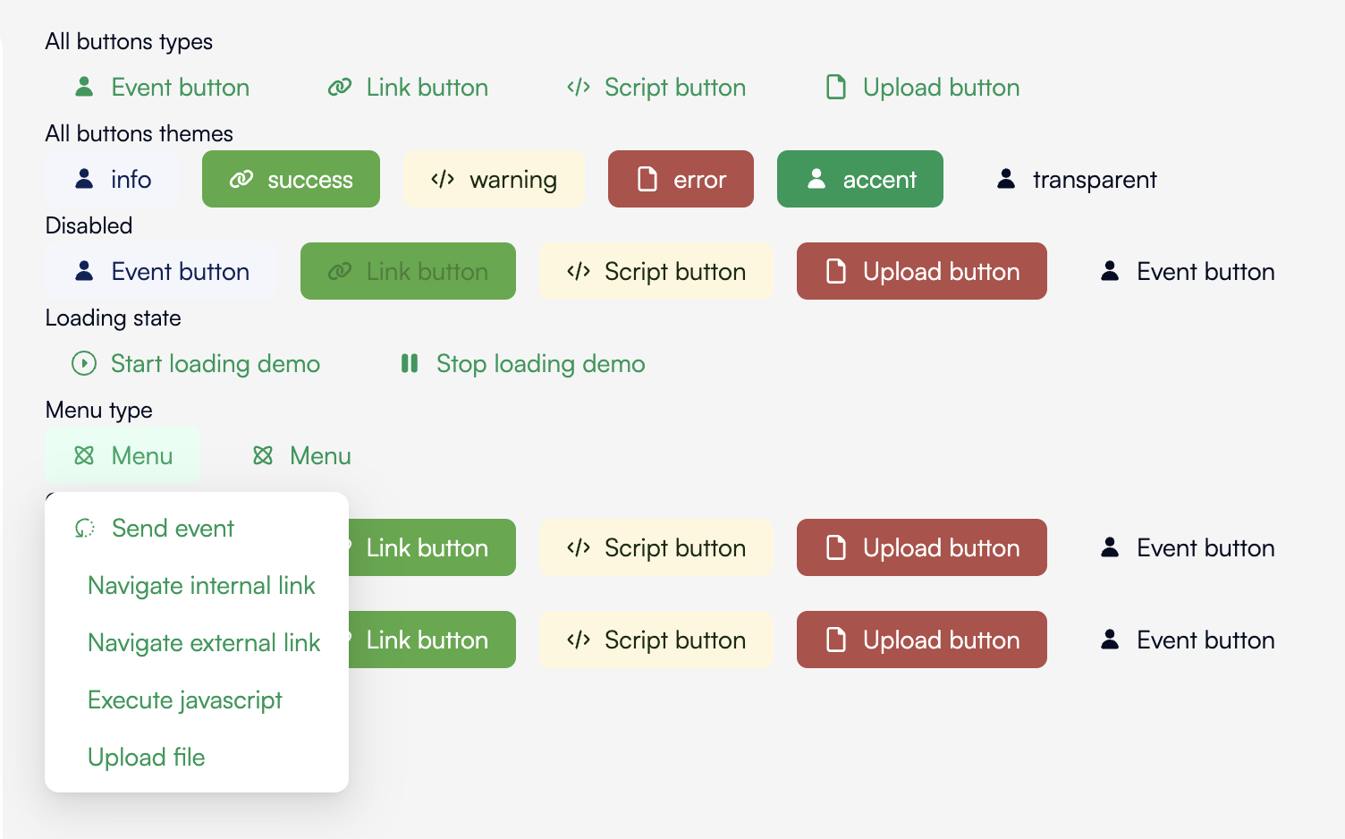
type influences on the behavior of the button. Followings types are available:
  • event will emit the event set on value. value can be just a string or an object with event and payload.
    # Page/Block
    - slug: Button
      type: event
      value: clicked
    - slug: Button
      type: event
      value:
        event: clicked
        payload:
          with: foo
    
  • internal and external are just href links and will navigate to the link set on value``. valuecan be a single string or an object withhrefandpopup`.
    # Page/Block
    - slug: Button
      type: internal
      value: another-page
    - slug: Button
      type: internal
      value:
        href: another-page
        popup: true # Open in a new window
    
  • script executes javascript set on value.
    # Page/Block
    - slug: Button
      type: script
      value: |-
        console.log('it works')
    
  • upload opens a system file picker and emit the event set on value with the file url in payload. value can be a single string or an object like value of event type plus an accept attribute which allow to restrict the files types the user can select.
    # Page/Block
    - slug: Button
      type: script
      type: upload
      value: upload file
    - slug: Button
      type: script
      type: upload
      value:
        event: upload file
        with: foo
    - slug: Button
      type: script
      type: upload
      value:
        event: upload file
        accept: image/*
    
  • menu displays a menu with a list of buttons. its value is an array of another buttons descriptions. A menu can contains another menu and so on.
    # Page/Block
    - slug: Button
      content: Actions
      type: menu
      value:
        - content: First action
          type: event
          value: clicked on first action
        - content: second action
          type: event
          value: clicked on second action
        - content: Other actions
          type: menu
          value:
            - content: Upload something
              type: upload
              value: upload something
    
disabled set the button as disabled. Useless while a callback takes times. Example:
# Page/Block
- slug: Button
  content: Click me
  updateOn: update button
  type: event
  value: clicked
  disabled: '{{loading}}'
# Automation
- emit:
    event: udpate button
    payload:
      loading: true
- do something very long: {}
- emit:
    event: udpate button
    payload:
      loading: false
loading replace or add an spinner icon to your button. Example:
# Page/Block
- slug: Button
  content: Click me
  updateOn: update button
  type: event
  value: clicked
  loading: '{{loading}}'
# Automation
- emit:
    event: udpate button
    payload:
      loading: true
- do something very long: {}
- emit:
    event: udpate button
    payload:
      loading: false
You can mix it with disabled:
# Page/Block
- slug: Button
  content: Click me
  updateOn: update button
  type: event
  value: clicked
  loading: '{{loading}}'
  disabled: '{{loading}}'
confirm will ask a confirmation before trigger the action.
# Page/Block
- slug: Button
  content: Click me
  type: event
  value: clicked
  confirm:
    title: Are you sure?
confirm object takes the following attributes:
  • title is title of the box displayed to the user. It can be a string or a localized string:
    # Page/Block
    - slug: Button
      content: Click me
      type: event
      value: clicked
      confirm:
        title:
          en: Are you sure?
          fr: Êtes vous sur ?
    
  • label is the main text displayed to the user. It can be a string or a localized string:
    # Page/Block
    - slug: Button
      content: Click me
      type: event
      value: clicked
      confirm:
        title: Are you sure?
        label: All your work will be destroyed for ever.
    
  • yesLabel is the label of the confirm button:
    # Page/Block
    - slug: Button
      content: Click me
      type: event
      value: clicked
      confirm:
        title: Are you sure?
        label: All your work will be destroyed for ever.
        yesLabel: Yes, destroy everything
    
  • noLabel is the label of the cancel button:
    # Page/Block
    - slug: Button
      content: Click me
      type: event
      value: clicked
      confirm:
        title: Are you sure?
        label: All your work will be destroyed for ever.
        yesLabel: Yes, destroy everything
        noLabel: No please, I've made a mistake
    
  • placement position the dropdown around the button. Default will adapt automaticall but you can force with:
    • ‘top’
    • ‘left’
    • ‘right’
    • ‘bottom’
    • ‘topLeft’
    • ‘topRight’
    • ‘bottomLeft’
    • ‘bottomRight’
    • ‘leftTop’
    • ‘leftBottom’
    • ‘rightTop’
    • ‘rightBottom’
    # Page/Block
    - slug: Button
      content: Click me
      type: event
      value: clicked
      confirm:
        title: Are you sure?
        label: All your work will be destroyed for ever.
        yesLabel: Yes, destroy everything
        noLabel: No please, I've made a mistake
        placement: bottom
    
  • mode changes the way the box is displayed. Default is dropdown which display a dropdown around the button. modal displays the box over the screen as a dialog box.
    # Page/Block
    - slug: Button
      content: Click me
      type: event
      value: clicked
      confirm:
        title: Are you sure?
        label: All your work will be destroyed for ever.
        yesLabel: Yes, destroy everything
        noLabel: No please, I've made a mistake
        mode: modal