Blocks
Build reusable UI components that communicate through events in the AI Builder framework
Blocks are reusable UI components that serve as the building blocks for creating interactive interfaces in AI Builder. They encapsulate functionality, emit and listen for events, and can be assembled to create complete user experiences.
Block Fundamentals
Blocks are modular UI components with specific purposes:
- Self-contained: Each block encapsulates specific functionality
- Reusable: Can be used across multiple pages and workspaces
- Configurable: Customizable through properties and settings
- Interactive: Respond to user actions and system events
- Event-driven: Communicate with other components through events
Blocks follow the BlockProtocol.org standard, ensuring consistency and interoperability.
AI Builder provides several categories of blocks:
- Built-in Blocks: Core components provided by the platform
- Apps Store Blocks: Components from installed Apps provided by Prisme.ai
- Template Blocks: Pre-configured blocks within your workspaces for specific use cases
- Custom Blocks: Your own blocks created from the design system published on the App store
Each type serves different purposes in your application.
Blocks communicate through an event-driven model:
- Event Emission: Blocks emit events when something happens
- Event Listening: Blocks listen for events from other components
- Data Exchange: Events carry payloads with information
- Asynchronous Communication: Non-blocking interaction pattern
This communication model enables loose coupling between components.
Common Block Properties
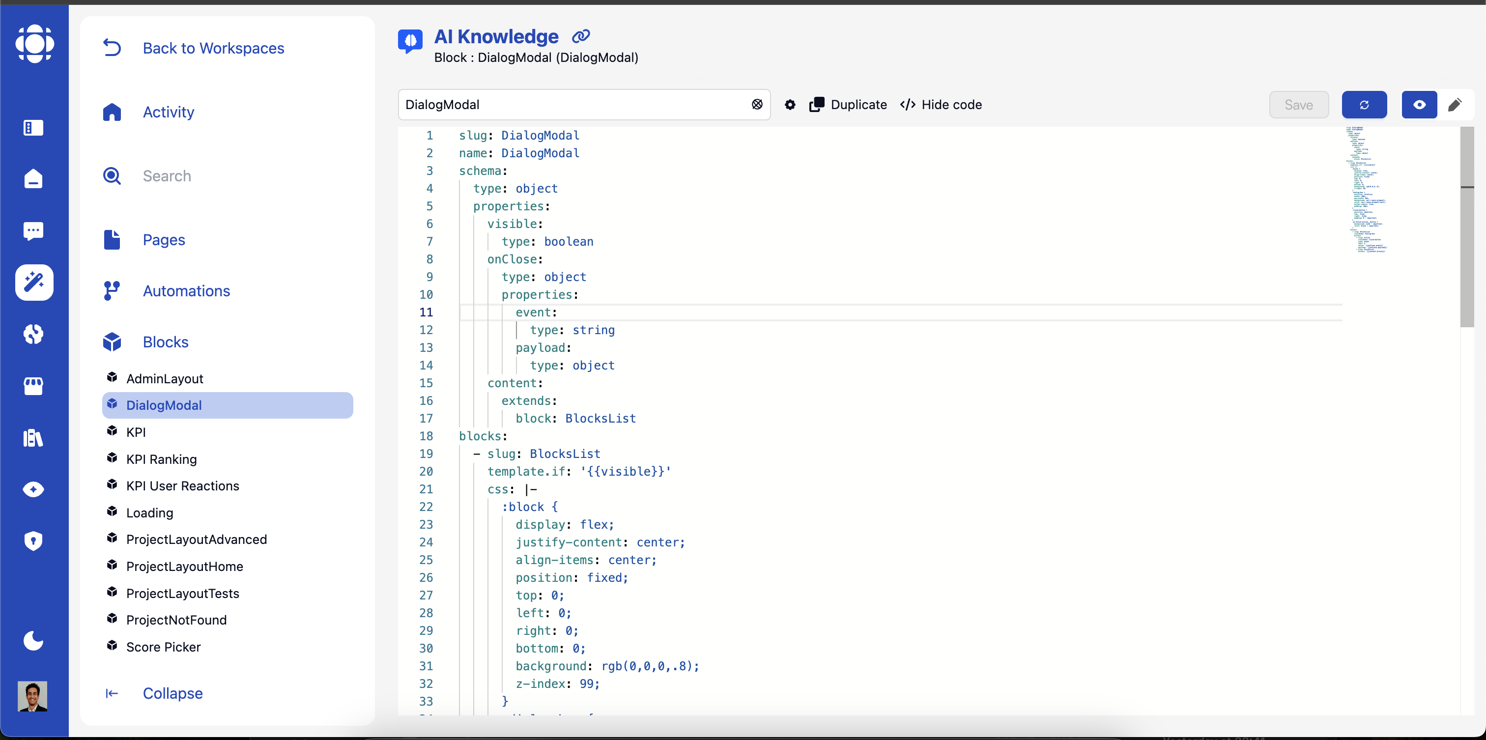
All blocks share a set of common properties that can be configured in YAML:
Built-in Blocks Library
AI Builder includes a comprehensive library of built-in blocks. Here’s a detailed reference for each block with its specific YAML configuration.
Form Block
Display an interactive form with validation.
RichText Block
Display formatted text with support for Markdown and HTML.
Action Block
Create interactive buttons and links.
DataTable Block
Display tabular data with sorting, filtering, and pagination.
Image Block
Display an image with optional caption.
Carousel Block
Display a slideshow of multiple blocks.
TabsView Block
Display content in tabbed interface.
Signin Block
Display a sign-in or sign-up form.
Toast Block
Display notification messages.
Hero Block
Display a hero section with title, lead text, and background image.
Footer Block
Display a page footer.
BlocksList Block
Display a collection of blocks.
Breadcrumbs Block
Display navigation breadcrumbs.
Charts Block
Display data visualizations.
Marketplace Blocks
The following blocks are available after installing specific apps from the marketplace.
Dialog Box Block
Display an interactive chat interface.
Popover Block
Display content in a floating popover.
Block Event System
The event system is the core communication mechanism between blocks:
Event Types
Event Communication Pattern
Event Definition
Blocks define the events they will emit:
This creates an event on the system when the end user interacts with blocks
Event Subscription
Other automations register to receive specific events:
This tells the automation to listen for the specified event and call the appropriate handler when it occurs.
Advanced Block Features
Block Best Practices
Single Responsibility
Design blocks to do one thing well:
Focus on a specific UI function
Avoid creating overly complex blocks
Split complex functionality into multiple blocks
Create specialized blocks for specific use cases
Clear Naming
Use consistent, descriptive naming:
Choose clear, descriptive block names
Use consistent terminology across blocks
Establish naming conventions for properties and events
Document the purpose of each block
Robust Error Handling
Design blocks to handle failures gracefully:
Validate inputs and handle edge cases
Provide clear error states and messages
Implement fallback behavior for missing data
Log issues for troubleshooting
Accessibility
Ensure blocks work for all users:
Follow WCAG guidelines for accessibility
Support keyboard navigation
Include screen reader compatible markup
Maintain sufficient color contrast
Responsive Design
Optimize blocks for all device sizes:
Test across different screen sizes
Implement responsive layouts
Adjust content for mobile displays
Use relative units for sizing
Performance Optimization
Keep blocks efficient and responsive:
Minimize unnecessary renders
Optimize heavy operations
Implement loading states for async operations
Use lazy loading where appropriate
Next Steps
Was this page helpful?