> ## Documentation Index
> Fetch the complete documentation index at: https://docs.prisme.ai/llms.txt
> Use this file to discover all available pages before exploring further.
# Visualizations
> Build charts and dashboards from your collections
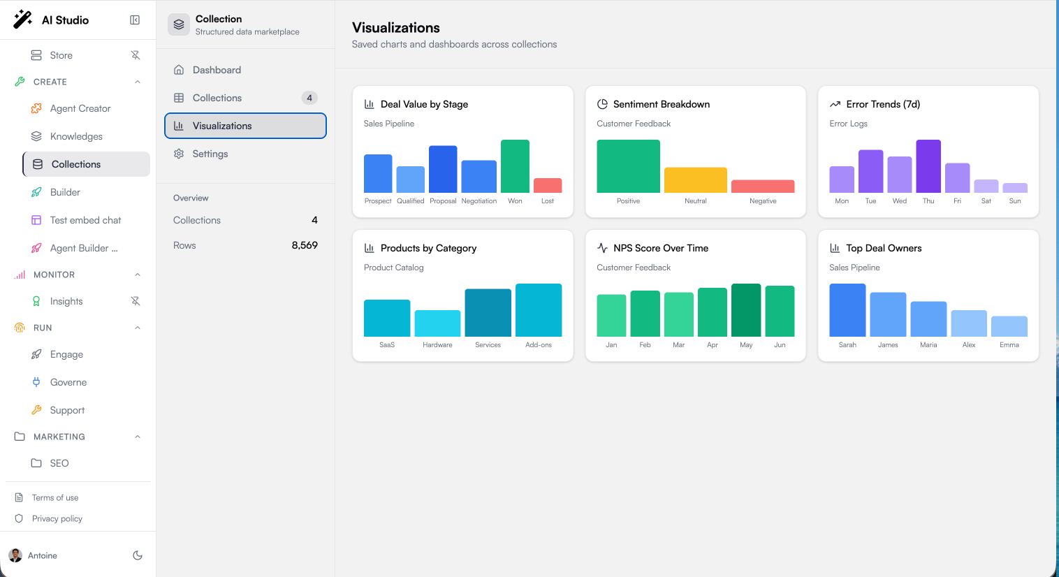 Visualizations turn your collections into charts — distributions, trends, and comparisons — without exporting anything to a spreadsheet. Charts live in two places:
* The **Visualize** tab of a collection — charts built from that collection's data
* The **Visualizations** page — all your saved charts across collections, in one dashboard
## Chart Types
| Type | Best for | Example |
| ----------- | --------------------------------------- | ------------------------------- |
| **Bar** | Comparing categories | Deal value by pipeline stage |
| **Line** | Trends over time | NPS score by month |
| **Pie** | Distribution of a whole | Sentiment breakdown of feedback |
| **Scatter** | Correlation between two numeric columns | Price vs. stock level |
| **Heatmap** | Density across two dimensions | Errors by service and severity |
## Creating a Chart
From a collection's detail page, switch to **Visualize** and click **New Chart**.
Pick Bar, Line, Pie, Scatter, or Heatmap.
* **X Axis** — the column to spread across (a category or a date)
* **Y Axis** — the numeric column to measure
* **Group By** (optional) — split the measure into series by another column
Choose how values are combined: **Sum**, **Average**, **Count**, **Min**, or **Max**.
Give the chart a title and click **Create**. It appears in the collection's Visualize tab and on the global Visualizations page.
Charts compute over the **entire collection**, using the same exact aggregation engine agents use. A "Sum of deal\_value by stage" bar chart and an agent answering "total pipeline by stage" produce the same numbers.
## Example Charts
A few combinations that work well as a starting dashboard:
* **Sales pipeline** — Bar chart: sum of `deal_value` by `stage`; Bar chart: count of deals by `owner`
* **Customer feedback** — Pie chart: count by `sentiment`; Line chart: average `nps_score` by month
* **Product catalog** — Bar chart: count of products by `category`
* **Error logs** — Line chart: error `count` by day; Heatmap: errors by `service` and `severity`
## Best Practices
Charts group by exact values. Normalize category columns (consistent casing and wording) before building charts, or you will see duplicate bars for the same logical category.
Sum and Average silently skip empty cells. If a numeric column has many gaps, a Count chart gives a more honest picture of your data.
Three to six charts per topic is usually enough. If a chart never changes your decisions, remove it.
## Next Steps
Clean your data before charting it
Let agents run the same aggregations conversationally
Visualizations turn your collections into charts — distributions, trends, and comparisons — without exporting anything to a spreadsheet. Charts live in two places:
* The **Visualize** tab of a collection — charts built from that collection's data
* The **Visualizations** page — all your saved charts across collections, in one dashboard
## Chart Types
| Type | Best for | Example |
| ----------- | --------------------------------------- | ------------------------------- |
| **Bar** | Comparing categories | Deal value by pipeline stage |
| **Line** | Trends over time | NPS score by month |
| **Pie** | Distribution of a whole | Sentiment breakdown of feedback |
| **Scatter** | Correlation between two numeric columns | Price vs. stock level |
| **Heatmap** | Density across two dimensions | Errors by service and severity |
## Creating a Chart
From a collection's detail page, switch to **Visualize** and click **New Chart**.
Pick Bar, Line, Pie, Scatter, or Heatmap.
* **X Axis** — the column to spread across (a category or a date)
* **Y Axis** — the numeric column to measure
* **Group By** (optional) — split the measure into series by another column
Choose how values are combined: **Sum**, **Average**, **Count**, **Min**, or **Max**.
Give the chart a title and click **Create**. It appears in the collection's Visualize tab and on the global Visualizations page.
Charts compute over the **entire collection**, using the same exact aggregation engine agents use. A "Sum of deal\_value by stage" bar chart and an agent answering "total pipeline by stage" produce the same numbers.
## Example Charts
A few combinations that work well as a starting dashboard:
* **Sales pipeline** — Bar chart: sum of `deal_value` by `stage`; Bar chart: count of deals by `owner`
* **Customer feedback** — Pie chart: count by `sentiment`; Line chart: average `nps_score` by month
* **Product catalog** — Bar chart: count of products by `category`
* **Error logs** — Line chart: error `count` by day; Heatmap: errors by `service` and `severity`
## Best Practices
Charts group by exact values. Normalize category columns (consistent casing and wording) before building charts, or you will see duplicate bars for the same logical category.
Sum and Average silently skip empty cells. If a numeric column has many gaps, a Count chart gives a more honest picture of your data.
Three to six charts per topic is usually enough. If a chart never changes your decisions, remove it.
## Next Steps
Clean your data before charting it
Let agents run the same aggregations conversationally